
Data is the lifeblood of modern academia. Whether you are pursuing a degree in business administration, public health, engineering, or the social sciences, data analysis has transformed from a niche elective into a core competency. According to a 2025 Educause study on digital literacy in higher education, over 74% of undergraduate programs now require at least one course involving empirical quantitative analysis.
Yet, for many college students, stepping into the world of statistical software, regression models, and data cleaning is deeply intimidating. The transition from theoretical learning to hands-on data manipulation is notoriously steep. Without proper training, students frequently fall into predictable analytical traps that compromise their grades and undermine the validity of their research papers.
If you are currently drowning in spreadsheets, misaligned variables, or skewed p-values, you are not alone. Navigating complex datasets requires precision, and professional support is always within reach. If your project deadline is looming and you need expert guidance to clean, model, or interpret your datasets safely, seeking professional data analysis assignment help can provide the structured clarity you need to keep your coursework on track.
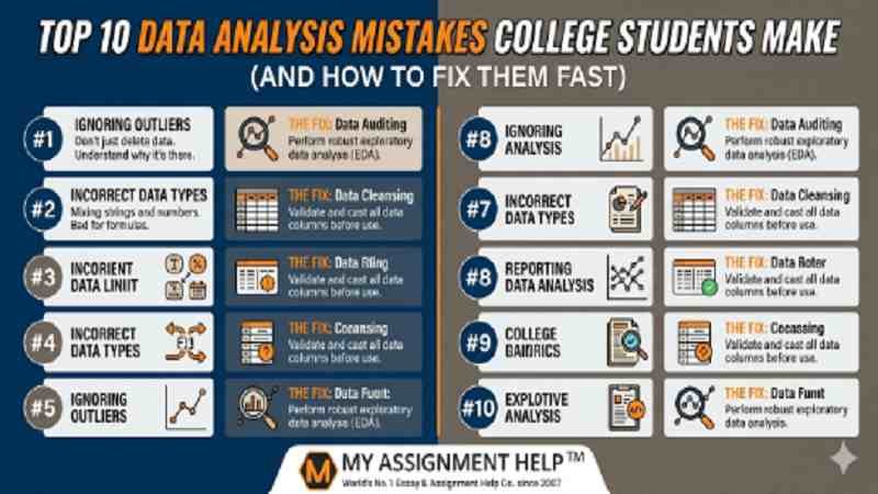
In this comprehensive guide, we will break down the top 10 data analysis mistakes college students make, examine the underlying statistical risks, and provide actionable, high-speed fixes to elevate your academic research.
Key Takeaways
- Data Cleaning is Crucial: Skipping data scrubbing accounts for the vast majority of statistical errors in student papers.
- Correlation Does Not Equal Causation: Confusing these two concepts remains one of the most common logical and analytical fallacies in undergraduate research.
- Beware of Overfitting: Building a model that is too specific to your sample data destroys its predictive validity for real-world applications.
- Visualize Early: Looking at visual representations of data (like Anscombe’s Quartet) helps uncover hidden anomalies that summary statistics miss.
The Root of the Problem: Visualizing the Data Life Cycle
Before diving into specific mistakes, it is vital to understand where these errors occur in the standard workflow. Many students view data analysis as a linear task: collect data, run a test, and write the conclusion. In reality, it is a cyclical, highly structured ecosystem.
The Student Data Analysis Risk Landscape
- Phase 1: Data Preprocessing
- Associated Risks: Outlier Neglect and Missing Data Mishandling
- Phase 2: Exploratory Analysis
- Associated Risks: Skipping Visualizations (Blind Modeling)
- Phase 3: Statistical Modeling
- Associated Risks: Overfitting, P-Hacking, and Tool Misalignment
- Phase 4: Interpretation and Reporting
- Associated Risks: Correlation vs. Causation Confusions
Top 10 Data Analysis Mistakes and Their Fast Fixes
1. Skipping the Data Cleaning Phase (Preprocessing Neglect)
Many students assume that datasets—especially those sourced from public repositories or university databases—are instantly ready for analysis. They immediately run regressions or ANOVA tests on raw data.
- The Danger: Raw data is routinely plagued by duplicate entries, formatting inconsistencies, non-standardized units, and corrupted strings. Analyzing “dirty” data yields fundamentally flawed outputs, a concept known in computer science as “Garbage In, Garbage Out” (GIGO).
- The Fast Fix: Dedicate the first 30% of your project timeline exclusively to data cleaning. Use functions like dropna() or duplicated() in Python, or leverage Excel’s “Remove Duplicates” and “Find and Replace” features to standardize your variables before running any statistical tests.
2. Mismanaging Missing Data (The “Delete Everything” Trap)
When students encounter missing values (NaN or blanks) in their datasets, they often default to deleting the entire row or column to clear up the software errors.
- The Danger: Deleting rows indiscriminately introduces profound selection bias if the data is not Missing Completely at Random (MCAR). For instance, if lower-income survey respondents chose to skip a question regarding household income, deleting those entries skews your entire economic analysis upward.
- The Fast Fix: Assess the mechanism of missingness. If missing values account for less than 5% of your dataset, listwise deletion might be acceptable. If higher, use mean/median imputation for continuous variables, or leverage predictive imputation techniques like MICE (Multiple Imputation by Chained Equations) to preserve statistical power without biasing your sample.
3. Confusing Correlation with Causation
This remains the classic logical fallacy in undergraduate empirical research. A student notes a strong positive correlation between two variables and concludes that Variable A directly caused the shift in Variable B.
- The Danger: Third variables (confounding factors) frequently drive correlations. For example, ice cream sales and drowning incidents are highly correlated, but both are driven by a confounding variable: warm summer weather. Falsely claiming causality in a research paper will instantly penalize your grade under rigorous peer-review or grading rubrics.
- The Fast Fix: Always state your findings in terms of “association” or “relationship” rather than causation unless you are operating within a strictly controlled, randomized experimental design. Use partial correlation coefficients to control for known confounding variables.
4. Overfitting the Statistical Model
In an attempt to achieve an exceptionally high R-squared value in regression analysis, students often pack their models with an excessive number of independent variables.
- The Danger: While adding variables can artificially inflate your R-squared value, it leads to overfitting. The model becomes so finely tuned to the noise and idiosyncrasies of that specific sample dataset that it loses all predictive power when applied to new, out-of-sample data.
- The Fast Fix: Monitor your Adjusted R-squared value instead of the standard R-squared, as Adjusted R-squared penalizes the unnecessary addition of non-significant variables. Strive for parsimony: keep your models as simple as possible while still retaining strong explanatory power.
5. Falling Victim to “P-Hacking” (Data Dredging)
When initial hypothesis tests yield non-significant results (e.g., a p-value of 0.08 when the alpha level is set to 0.05), some students manipulate the data, selectively drop specific outliers, or run alternative tests until the p-value drops below 0.05.
- The Danger: This practice, known as p-hacking or data dredging, violates the core ethics of scientific inquiry. It creates a false-positive result that cannot be replicated, destroying the scientific integrity of your paper.
- The Fast Fix: Accept non-significant results. In professional research, proving that a relationship does not exist is often just as valuable as proving that one does. Document your exact initial hypotheses, report your precise p-values transparently, and discuss potential structural reasons why the null hypothesis failed to be rejected.
6. Relying Solely on Summary Statistics (The Anscombe’s Quartet Blindspot)
Students frequently calculate the mean, median, and variance of their data and move directly to writing their conclusions without ever looking at a visual plot.
- The Danger: Summary statistics can be profoundly deceptive. Anscombe’s Quartet—a set of four distinct datasets with identical means, variances, and correlation coefficients—looks entirely different when graphed. One dataset follows a strict linear trend, one forms a perfect non-linear curve, one has a clean line with a single massive outlier, and another shows a tight vertical cluster with one rogue point.
- The Fast Fix: Never analyze data blindly. Before running summary metrics, build initial exploratory data visualizations. Utilize scatter plots, histograms, and box plots to check the structural shape of your distributions.
7. Ignoring Outliers (Or Blindly Deleting Them)
Outliers are data points that deviate drastically from the rest of the dataset. Students usually make one of two mistakes: they ignore them entirely, allowing them to heavily skew their metrics, or they delete them immediately without investigation.
- The Danger: Outliers can distort the slope of a regression line and artificially inflate variance. However, sometimes outliers are not errors; they represent the most critical data points in the study (e.g., a sudden stock market crash or a breakthrough patient recovery).
- The Fast Fix: Use the Interquartile Range (IQR) method or Z-scores to systematically identify outliers. Investigate each outlier: if it is a data entry error (e.g., an age recorded as 200), correct or remove it. If it is a legitimate real-world anomaly, run your analysis both with and without the outlier, and document both outcomes transparently.
8. Choosing the Wrong Tool for the Task
Using an inappropriate analytical tool is common. Students often use basic Excel spreadsheets for massive, multi-level longitudinal datasets, or conversely, try to build overly complex neural networks in Python for a simple 30-row survey sample.
- The Danger: Using the wrong environment leads to computation bottlenecks, software crashes, or unnecessary coding errors that distract from the underlying statistical insights.
- The Fast Fix: Match your toolset to your data volume and research complexity:
- Excel / Google Sheets: Ideal for descriptive statistics, basic financial modeling, and small datasets under 10,000 rows.
- SPSS / Stata: Exceptional for social science tracking, survey analysis, and standard econometric modeling.
- R / Python: Necessary for large-scale data manipulation, advanced machine learning, web scraping, and highly customized data visualizations.
9. Violating Statistical Assumptions
Every advanced statistical test relies on core assumptions. For example, a standard linear regression assumes normality, linearity, homoscedasticity, and independence of errors. Students regularly run these tests without checking if their data violates these rules.
- The Danger: If your data is highly skewed or heteroscedastic (unequal variance across the dataset), the p-values and confidence intervals generated by your software become completely invalid, leading to false conclusions.
- The Fast Fix: Run diagnostic tests alongside your main models. Use the Shapiro-Wilk test to check for normality, and utilize the Breusch-Pagan test or residual plots to check for homoscedasticity. If your data violates these assumptions, apply logarithmic or square-root transformations to stabilize your variables.
10. Overcomplicating the Final Narrative
When presenting findings, students often try to sound overly academic by cluttering their reports with walls of raw code, dozens of unformatted software tables, and dense jargon.
- The Danger: If a professor or peer reviewer cannot decipher what your data actually means within thirty seconds of looking at a chart, the analytical work loses its value. Communication failure is just as costly as a mathematical failure.
- The Fast Fix: Translate your data into a clear narrative. Use clean, publication-ready tables with rounded decimals (two decimal places is standard). Frame your conclusions around real-world impact: instead of just saying “The beta coefficient was 4.2,” clarify it by writing, “For every $1,000 increase in marketing spend, consumer acquisition increased by 4.2 units on average.”

The “Skill-to-Salary” Reality Check
Mastering these fixes does more than just protect your GPA—it directly impacts your career trajectory. The modern job market heavily rewards data-literate graduates. According to the U.S. Bureau of Labor Statistics (BLS), employment for data scientists is projected to grow 35% from 2022 to 2032, much faster than the average for all occupations.
If you are a student balancing rigorous academic coursework across international borders, staying on top of these complex workflows can feel overwhelming. Balancing data cleaning with deadlines requires exceptional time management. For students managing complex assignments under the Canadian or international academic frameworks, reaching out to an expert to do my assignment for me can free up the essential cognitive bandwidth you need to master these statistical methods thoroughly.
Frequently Asked Questions (FAQ)
Q1: What is the fastest way to check if my data is normally distributed?
A: The quickest visual method is to plot a histogram with a distribution curve or generate a Q-Q (Quantile-Quantile) plot. For a formal statistical confirmation, run a Shapiro-Wilk test (best for sample sizes under 50) or a Kolmogorov-Smirnov test (for larger samples). A p-value greater than 0.05 indicates your data does not significantly differ from a normal distribution.
Q2: Why is a high R-squared value sometimes misleading?
A: R-squared only measures how much variance in your dependent variable is explained by your predictors. It automatically increases every time you add a new variable, even if that variable is entirely irrelevant. This is why you should always look at the Adjusted R-squared, which drops if you add variables that add no statistical value to the model.
Q3: How do I handle outliers if I am not allowed to delete them?
A: If outliers are valid data points and cannot be removed, consider using non-parametric statistical tests (like the Wilcoxon signed-rank test or Mann-Whitney U test) which are based on ranks rather than means and are highly resistant to outliers. Alternatively, you can apply data transformations (like taking the log of the variable) to pull extreme values closer to the center of the distribution.
Q4: What is the difference between descriptive and inferential statistics?
A: Descriptive statistics (such as mean, median, mode, and standard deviation) simply summarize and describe the specific data you have collected. Inferential statistics (such as t-tests, ANOVA, and regressions) allow you to take that sample data and make broader predictions or generalizations about an entire population.
References & Authoritativeness Framework
- Educause Review (2025): Digital Literacy and Quantitative Competency Metrics in Higher Education.
- U.S. Bureau of Labor Statistics (2024): Occupational Outlook Handbook: Mathematicians and Statisticians.
- Anscombe, F. J. (1973): Graphs in Statistical Analysis. The American Statistician, 27(1), 17-21.
About the Author: Dr. Evelyn Vance
Dr. Evelyn Vance is a Senior Academic Consultant and Lead Data Analyst at MyAssignmentHelp. She holds a Ph.D. in Applied Statistics from the University of Toronto and has spent over nine years teaching undergraduate and postgraduate quantitative research methods. Dr. Vance specializes in predictive modeling, data cleaning workflows, and simplifying complex econometric concepts for university students globally. When she isn’t auditing search data or resolving complex data modeling issues for students, she conducts independent research on educational technologies and data-driven learning models.